Belinda Lindhardt

Wednesday, September 27, 2006


i thought i had already posted this but turns out i hadnt so here is the horses update with the sky that was done last week.
i had a bit of trouble with the clouds / sky, this is by no means finished. going to revisit it once the horses are in so here is the update so far

kids mirrors


Well i have been away and had a 2.5year old with gastro so the drawing has been put on hold for a few days while i deal with that. But i have done a bit of work on my other artistic venture which is customised painted kids mirrors amoung other things. I have had 3 of them on my desk for a couple of months now, but we have a birthday party to go to on the weekend which i thought would make a nice gift so i better get cracking on it. So here is a pic of this one so far and some past ones. I havent decided whether to do the stick on letters for this one or not simply because i cant get to the shop to buy some ! :)

Tuesday, September 19, 2006

Horses Update

I have pushed on further with the grass. There is still a bit further to go but for now this is fine.

I used bits of felt to blend the grasses together as well as varing my strokes. I also have used cooler colours towards the back and warmer to the front its not that noticable but something i will endeavour to take more notice with next time around.

Tuesday, September 12, 2006

So, i have made a start on my horses :) I have started with my pastel underpainting and with my backgrounds first. At the moment there is only blue pastel on the sky but i have started with more detail on the grass i applied quite a few layers of cp.

Being so large i found that i was making my usual mistake of not looking at the values and working "too close" so i stood up and worked which i found really helped as i could see the drawing as a whole in stead of in sections. It also allowed me to add in some different types of strokes i held the pencil very loosely almost laying it down on the paper as i worked and moved the position of it constantly (much like you do with charcoal) which allowed me to loosen up some.

I then very lightly dabbed places with some turpenoid to smooth the colour and cover the bits of paper, this should now allow me to go over it with much more detail.

Monday, September 11, 2006

Horses

After my last piece i found it was had to get the detail i wanted so with this next one i wanted to larger so this one will be A3 size. About the largest cp one i have done.

So i will be attempting some horses. Horses arent really my thing but after a recent visit to a horsestud i was inspired and given that Scone is such a big horse town if i can make a few pics to sell at the in-laws B&B that would be fantastic.

So here is the reference pic i have chosen thanks to rewston at wetcanvas.com. I wasnt happy with the composition of it so i added a bit to the top bottom and side :)

This one will be done on white colorfix paper, i really enjoyed the texture of the paper on the last piece but given that this one is white paper i will need to be adding in some underpainting to make the process faster.
So i have experimented with different materials ie. watercolour pencils, pastel and have decided to go with the pastel. Its fast, doesnt use water, colours can be mixed fairly easily and the pencil goes on fine over the top.

I seem to struggle when i have to do things like grass and sky i think this is mainly connected with not seeing values correctly and getting my colours. So i have done a bit of research with various books (mainly my Ann Kullberg books) and done a few experimental bits of grass and sky.
What i have learnt from this is:
- get my darks in first!
- use the eyedropper / value viewer to get the correct values and colours of what i am drawing not forgetting that cp mixes with the colours underneath and what it is to have a warm / cool shadow etc
- experiment more with different strokes and pressures
- start with a lighter colour to "roadmap" what i am drawing
- not forgetting to "roadmap" with complementary colours for shadows etc and roadmapping as i have learnt in previous pieces.

Welcome and Cumquats

I decided to start this to put down my thoughts and experiences mainly concerning my art simply because i keep forgetting!!! Everytime i do a piece i learn something new and then by the time i start the next one i have forgotten those lessons and then go "ahhh that right i remember this i have done this before" so anyway here is the blog. yay !

Cumquats
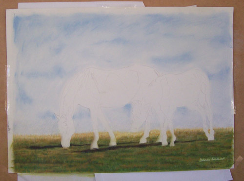
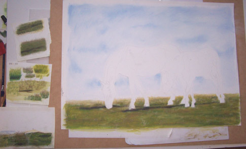
This is my latest piece "Cumquats" its my first one in quite some time after the birth of my second child Will. I had a hankering to do a new piece for a while and there were a few things i wanted to try which were: Dark paper, Artspectrum Colourfix paper, Rendering Glass and a subject which had some interesting lighting and shadows.


Out came the camera and took quite a few photos for composition this was the result. The final piece came out fairly well and met all the requirements of what i wanted to achieve so overall i am happy.

What i learn from this one:
- the importance of getting the drawing right, what you copy from a reference photo (even tho you trace it) doesnt mean that it looks right... so you need to adjust the drawing accordingly as i go along.
For the future this means to not being too finicky about the transfer of the drawing onto the paper, you adjust this as you go in terms of keeping all the lines perfect.
- Values - i got the values of the cloth & lemon completly wrong initially so i need to remember to get those values happening over the whole area before continuing on. i seem to really need to work on light colours .. darker colours ie. the flower i didnt have as much problem.
- I also learnt that erasing on Colourfix is great! you can erase almost back to the paper without any problem
- Dark paper - i work really well with the dark paper it seems to flow really easily for me i think i will use more of this in the future. i think its to do with that i am forced to put my lights down first.

As i said all in all i am happy with this one, one to frame and sell :)